On Wednesday morning at 8:30 Eastern, the Bureau of Labor Statistics publishes the September inflation figure. Economists expect 3.7%, up from 3.4% in August.
Here is the part that does not get said. Underneath that number, the price of almost everything you spend money on is rising at around 2.4% a year.
Both of those are true. The difference between them is mostly one thing, and you already know what it is if you have filled a tank recently.
What the number actually measures
The Consumer Price Index is a basket.
Statisticians survey what American households actually spend money on, then weight each category by how much of the typical budget it takes up. Prices get collected every month, each category's price change gets multiplied by its weight, and the results get added up. That total is the inflation rate.
So the weights decide everything. A category that is a large share of spending moves the number easily. A small one has to move violently to show up at all.
Here is roughly how the budget divides, using the weights in use for 2026:
- Shelter, meaning rent and the equivalent cost of living in a home you own: 35.6%
- Food, groceries and restaurants together: 13.7%
- Medical care: 8.4%
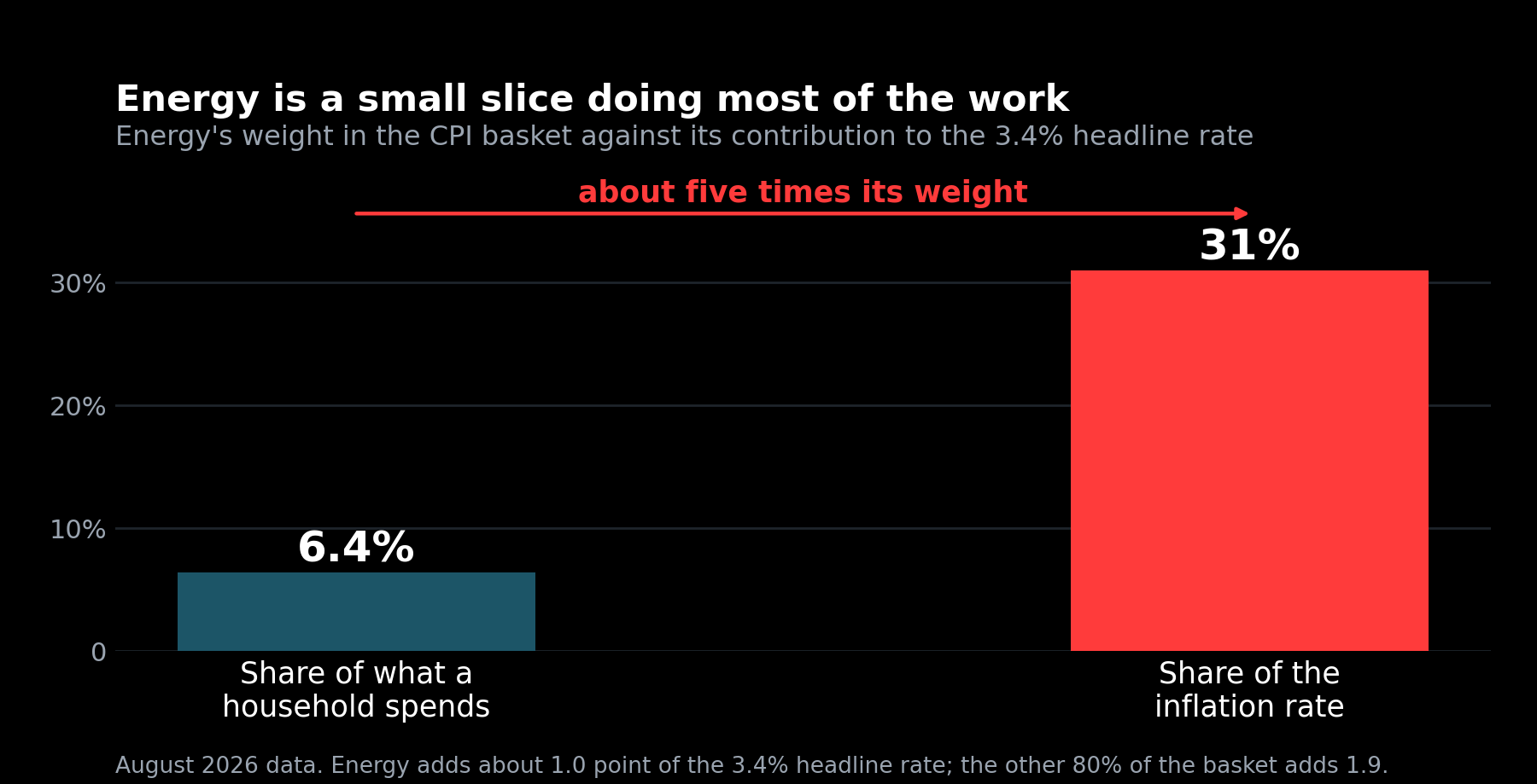
- Energy, meaning gasoline, electricity, natural gas and heating oil combined: 6.4%
- Gasoline on its own: 2.9%
Those four categories cover about 64% of the basket, and gasoline sits inside the energy figure rather than alongside it. The other 36% is everything else a household pays for: cars new and used, car insurance, repairs, airfares, clothes, furniture, appliances, phone plans, tuition, haircuts, veterinary bills, over-the-counter medicine. Hundreds of individual items, each with its own small weight.
Shelter alone is more than a third of the index. Gasoline is less than a thirtieth.
Hold onto that, because it is about to stop making sense.
Two numbers, and why they disagree
Every inflation report contains two headline figures, and they are measuring different things on purpose.
Headline inflation is the whole basket. Everything, including food and fuel.
Core inflation takes food and energy out and measures what is left.
Worth being exact about what "what is left" means, because it is easy to picture core as some narrow subset. It is not. Food is 13.7% of the basket and energy is 6.4%, so core is the other 79.9%. Nearly four fifths of everything you spend money on.
Statisticians split that remainder two ways. Core services, at 60.7% of the basket, is shelter plus medical services, airfares, car insurance, repairs, tuition, phone plans and the rest of what you pay people to do things. Core goods, at 19.2%, is the physical objects: cars, clothes, furniture, appliances, medicine off a shelf.
So when core comes in at 2.4%, that is the average price change across four fifths of a household's spending.
That sounds like cheating, and people reasonably object that food and fuel are exactly the things a household cannot avoid paying for. The reason for doing it is that food and energy prices swing hard on weather, wars and harvests, and those swings reverse. If you are trying to work out whether prices in general are drifting upward, a 30% move in gasoline tells you about oil markets rather than about the economy's underlying price level.
In August, headline inflation was 3.4%. Core was 2.4%.
That one percentage point gap is the whole story of this report, and it is almost entirely fuel.
How 6% of your spending moves a third of the number
Run the arithmetic and it becomes obvious.
The core part of the basket, which is about 80% of what you spend, was rising at 2.4%. That contributes roughly 1.9 percentage points to the total.
Food, at 13.7% of the basket, was rising 2.7%. That adds about 0.4 of a point.
Energy, at 6.4% of the basket, was rising 16.3%. That adds about 1.0 point.
Add them and you get about 3.3%, which is the 3.4% that was reported, give or take rounding.
So energy, which is 6.4% of what a household spends, is producing close to a third of the headline inflation rate. That is what it looks like when a small category moves violently enough.
The components underneath are what did it. In August, gasoline was up 27.4% from a year earlier. Fuel oil was up 52%. Electricity, by contrast, was up 3.8%, shelter 3.0%, food 2.7%.
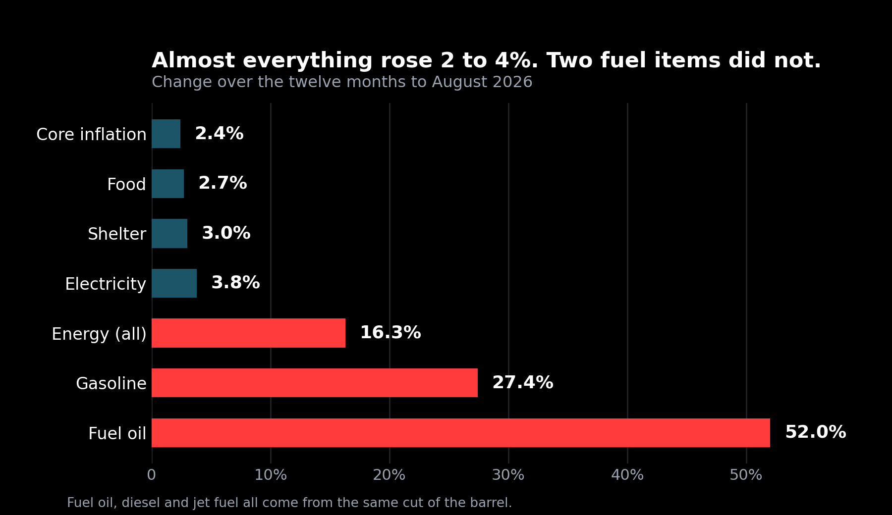
Look at that spread. Almost everything in the basket is rising at something between 2 and 4%. Two energy items are rising at twenty-seven and fifty-two.
Why fuel oil is up 52%
This is the part that connects to something we have written about twice already.
Fuel oil is heating oil. It comes out of the middle of a barrel of crude, the cut refiners call distillate, which is the same cut that produces diesel and jet fuel. Three products, one slice of the barrel, one shared constraint.
That constraint is what the diesel issue was about. Three of the world's refining regions stopped supplying distillate inside seven months, and the shortage was never in crude oil. It was in the plants that turn crude into finished fuel.
When that happened, diesel went to a record and jet fuel followed, which is how it reached an airline's profit forecast. Fuel oil is the third product from that same cut, and it went up 52%.
So the line item in Wednesday's inflation report is not a separate event. It is the refining squeeze, arriving in the official statistics about three months after it arrived at the pump.
Gasoline is a slightly different story, since it comes from a lighter part of the barrel, but it has had its own year. Gasoline prices have now matched 2022 for the most days above $4 a gallon in a single calendar year.
So what is worth watching on Wednesday?
Two questions, and the order they go in matters more than most coverage lets on.
First, did core move? Core is the 79.9% of the basket that is not food or fuel, services and goods together. If it is drifting upward, the increase has spread into things that do not come back down when a refinery restarts. That is the kind of inflation that sticks.
Second, how wide is the gap between headline and core? That tells you how much of the total is fuel and how much is everything else.
Those two questions can give different answers, and that is the part worth working through properly. Here are three ways the report can land. The first is the forecast, the other two are small variations around it.
| Headline | Core | Gap | How far core moved | What energy did | |
|---|---|---|---|---|---|
| August, actual | 3.4% | 2.4% | 1.0 | up 17.4% | |
| Case A | 3.7% | 2.5% | 1.2 | +0.1 | up about 21% |
| Case B | 3.85% | 2.5% | 1.35 | +0.1 | up about 23% |
| Case C | 3.8% | 2.6% | 1.2 | +0.2 | up about 21% |
Case A is the forecast. Core creeps up a tenth of a point, which is close to noise. The gap widens from 1.0 to 1.2, which means energy has gone from supplying about a third of the headline rate to about 36% of it. The reading is straightforward: the fuel problem got worse and nothing else changed much.
Case B looks the most alarming and is actually the mildest. Headline at 3.85 is the highest of the three and the gap at 1.35 is the widest. But core is 2.5%, exactly where it sits in Case A. Every bit of the extra headline came from fuel, which works out to energy rising about 23% over the year. The wide gap is the good news here, because it means the increase is sitting in the one part of the basket that reverses when supply recovers.
Case C has the same gap as Case A and is the one to take seriously. Headline 3.8%, core 2.6%. The gap is 1.2, identical to Case A. But core moved two tenths instead of one, twice as fast, and that is money leaving your pocket for reasons that have nothing to do with a refinery. Rent, services, insurance, repairs. None of that falls back when distillate supply returns.
So the ranking is not what the headline suggests. Case B, with the biggest number and the widest gap, is the least worrying. Case C, which ties Case A on the gap, is the most. The gap tells you where the pressure is coming from. Core tells you whether it is sticking.
Two caveats on the table. The energy figures are worked backward from the weights, holding food at its August rate of 2.7%, so treat them as the rough size of the move rather than a forecast of it. And a tenth of a point in either direction is within the normal month-to-month wobble of this series, so none of these cases is meaningfully different from its neighbours on a single report. The direction over three or four months is what carries information.
One more line to check, and it outranks everything above. Shelter is 35.6% of the basket, by far the most powerful item in the report, and it was running at 3.0% in August. A tenth of a point there moves the headline more than a full point of movement in gasoline does. If core surprises in either direction, shelter is usually the reason.
The Federal Reserve raised its benchmark rate on September 16, the first increase since 2023, and its next decision comes on October 28. Officials have said they watch core more closely than headline, for the reasons above. What they actually do with Wednesday's number is not something anyone outside the room can tell you.
So why do CPI and core tell different stories?
Because they cover different amounts of the same basket, and the part one of them leaves out is behaving nothing like the rest.
Headline counts everything. Core counts the 79.9% that is not food or fuel, and that part has been rising at about 2.4%, which is unremarkable. Shelter at 3.0% and food at 2.7% are not far off it either.
The entire gap is energy. It is 6.4% of what a household spends, and in the twelve months to August it rose 16.3%, with gasoline up 27.4% and fuel oil up 52%. A category that small has to move that violently to shift the total, and this year it did.
So the two numbers disagree because one of them contains a fuel shortage and the other does not. Headline tells you what the past year actually cost you. Core is the better guess at what will still be costing you after the refineries catch up.
What this doesn't tell you
The 3.7% figure is a forecast, not a result. Forecasts for this series are wrong regularly and in both directions, and the whole piece above describes the structure of the report rather than predicting its contents.
The basket is also not your basket. Those weights describe an average household, and nobody is average. If you drive ninety miles a day, energy is far more than 6.4% of your spending and your personal inflation rate is well above 3.4%. If you work from home and own your house outright, the opposite. The index is a national average that describes nobody in particular.
Core inflation has a real weakness too, and it is worth stating since this issue leaned on it. Energy is an input to almost everything, not just a thing you purchase directly. Trucking costs sit inside food prices. Jet fuel sits inside airfares, which are counted in core. Stripping energy out of the measurement does not strip it out of the economy, and a long enough fuel shock eventually shows up in core anyway. If that is happening, it would appear gradually and it would be hard to distinguish from ordinary price increases.
And one month of any series is noise. The direction over several months is the only part worth reading.
The habit underneath is the one this newsletter keeps coming back to. A single headline number is an answer to one specific question, and the useful work is knowing which question, and which part of the total actually moved. Techdamentals shows every input behind a fair value for exactly that reason.